Okay, your lines are clean but can still some mistakes like Batman's cowl looking like a version of Supes cape. Their heads seemed to drawn bigger than they should appear. The strokes you used for Superman's cape is a bit odd, they look like hair. I like how you drew them because I can see how disciplined you are with your strokes. Sometimes, this same discipline makes it a bit stiff. Look more into textures and the proper pen strokes to achieve it. They also look like the 80's versions, don't you think?
Now, you know the weak points. I'd like to see more of your work soon. You'll get it eventually. I know it.
2 comments:
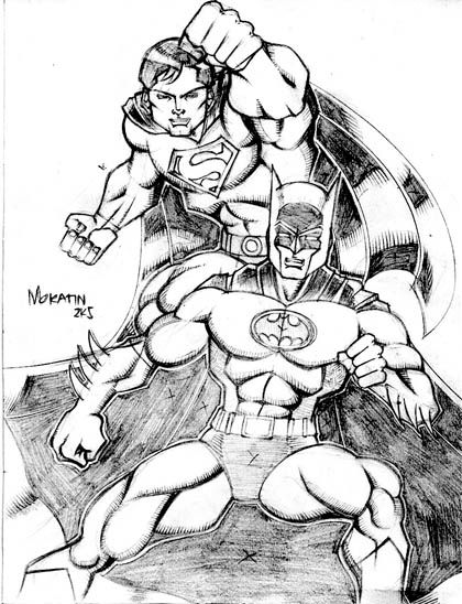
Okay, your lines are clean but can still some mistakes like Batman's cowl looking like a version of Supes cape. Their heads seemed to drawn bigger than they should appear. The strokes you used for Superman's cape is a bit odd, they look like hair. I like how you drew them because I can see how disciplined you are with your strokes. Sometimes, this same discipline makes it a bit stiff. Look more into textures and the proper pen strokes to achieve it. They also look like the 80's versions, don't you think?
Now, you know the weak points. I'd like to see more of your work soon. You'll get it eventually. I know it.
I agree with Mr. Monsanto, the drawing feels stiff.
I like the Adam West thing, though. lol
Post a Comment